Barcode app transition to content
Prototyping Design Flow OptimizationIn this post I'm only covering a small part of the project. If you want to learn more about how I work: Here's my general process.
"barcoo" is a barcode scanner app and a product guide. With over 14 Million downloads it is a strong competitor in the German market. As an usability consultant I had the opportunity to work with all the departments and could gather insights about the company's and the users' needs.
Challenge
Due to an increasing amount of editorial content the app start screen needed to adapt to the new strategy. My task was to create a modern interface that will aid the user in discovering more content.
Process
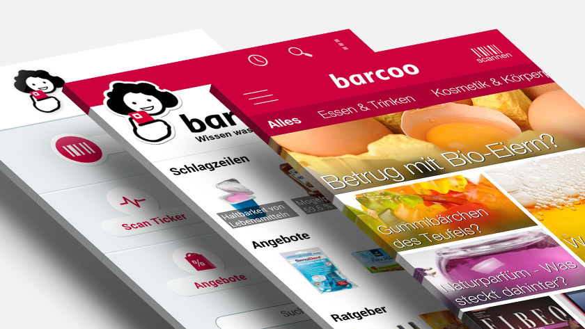
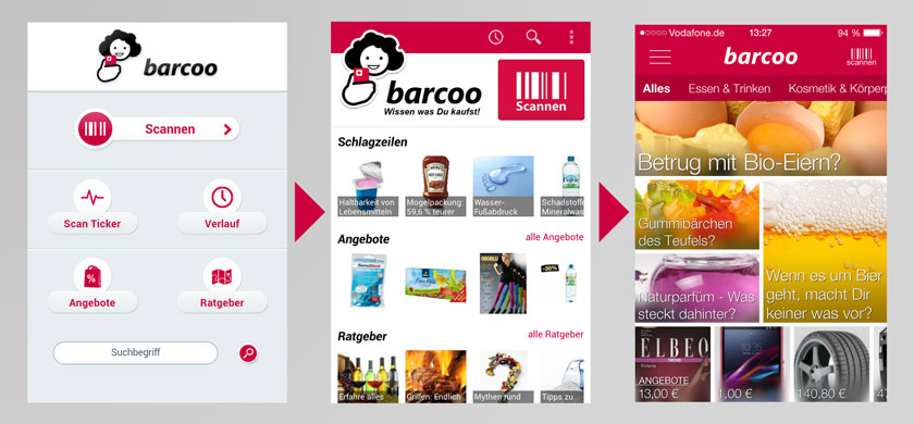
First I looked at several apps to gather information about common approaches other content centric apps use to display a lot of content. Furthermore a new navigation was needed to switch between different categories (like cosmetics, food and non-food, bio, etc.):
- The first iteration (app screen in the middle) was highly influenced by the Pulse (now "LinkedIn Pulse") way of combining vertical scrolling for categories with horizontal scrolling for more elements in a category. At this point the strategy wasn't yet as content focused as it was later on. The idea here was to make the different elements of the app more accessible (scan history, app features, special offers).
- The last big iteration (app screen on the right around Spring/Summer 2014) demanded an adaptation of the ever growing content department. Therefore I looked into rss-feedreader apps like Feedly, Flipboard and Google Play Kiosk.
- The navigation was inspired by the standard tab switch from Android or a more fancy approach is the one used by Shopkick with the navigation sliding in and out.
Once the overall structure was set the hardest part was to arrange and design the elements in order to not make it look cluttered.
Solution
Finally I combined the different ideas in numerous wireframes and came up with a modular system.
In order to catch the users' interest I used big eye catcher images overlayed with text (text over random images was also used in the Google Play Kiosk app). Each piece of content could make use of different modular sizes in order to give the app an ever new appearance. And the navigation was similar to the standard tabbed Android navigation. Swipe left or right for another category.
As I mentioned above the biggest struggle was the design of the elements. After numerous iterations we arrived at a solution where the text would have a slightly black background to improve the readability and in addition to blur the image behind the text.
Result
- Increase in user interaction
- More content discovered
- App was more often opened