Increasing the viewfinder by 10%
Pixel Perfect Design Design SystemIn this post I'm only covering a small part of the project. If you want to learn more about how I work: Here's my general process.
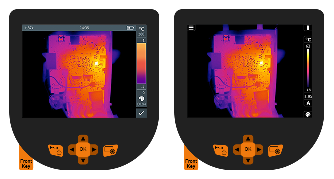
Left: Old design; Right: New design
Abstract: This project was a mixture between stakeholder management and pixel perfect design.
The stakeholder management was needed in order to argue away certain requirements and existing parts from the previous implementation in order to maximize the visible area for the user.
Making a pixel perfect design was important given this display only has a resolution of 320x240 pixels.
The challenge
This project didn't start at zero. We already had a previous generation of the infrared camera that we weren't supposed to deviate from too much.
The biggest request was in regards to the display: The previous camera was only operated via hardware keys. For the new version product management wanted to implement a touch screen.
Therefore, we had to maintain the former interaction model while adding the touch controls on top. While we were at it, we also wanted to update the UI design by implementing a new design system that would maximize the visible area of the display.
The process
As this was the first time I came into contact with this infrared camera I started out will a full review of the existing UI. Capturing every screen and dialog in order to fully understand the underlaying interaction model.
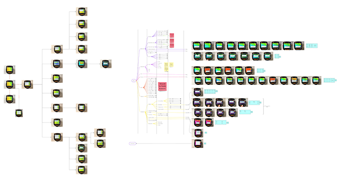
A collection of all available screens to create a mind map of the existing structure and elements.
The current interface had a rather straight forward interaction style. A cascaded menu, a bunch of radio buttons and checkboxes as well as dialogs with dropdowns and some more radio buttons and checklists.
During this phase I also noted down all the questions that came up that weren't mentioned in the new requirements. As this first part is quite similar to an expert UX review I could address a few things like inconsistencies that should be fixed along the way.
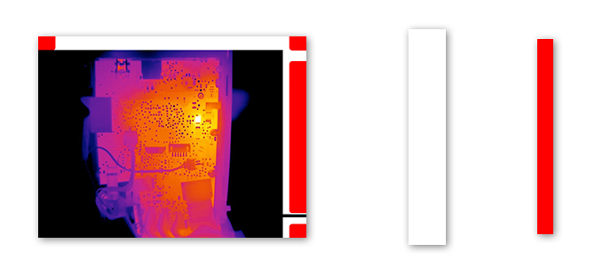
Left: The viewfinder with an overlay of the occupied area;
Middle/White: Old interaction overlay area size;
Right/Red: New interaction overlay area size
As the screen real estate is quite important for the user, we wanted to make sure to enlarge the visible area at all times. Therefore, we had to question every element in the screen and work closely with the product manager to make sure we didn't remove anything crucial.
Compared to a current Smartphone screen with super high pixel-per-inch resolutions this screen was quite the opposite: 320 x 240 pixels. So, every pixel counts. Although there were a few more caveats and aspects introduced by new feature requests I’ll focus only on the home screen and how I managed to expand the visible area by 10%.
The status bar
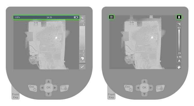
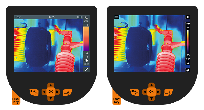
Instead of always blocking the whole upper area (left) only the currently active and relevant elements should be shown (right)
I questioned the need for every element on the status bar. Although there would still be quite a few different elements that need to be shown, most of the time the battery and the new menu icon would be the most relevant ones.
Instead of blocking the whole upper area all the time we would only block the parts that were really needed. If WIFI or Bluetooth were enabled or a headphone is connected only then they would show up there. If not, we save the space for the picture.
Furthermore, we removed the time and the camera name because on a daily basis they would not be important to show here.
The heat indicator scale
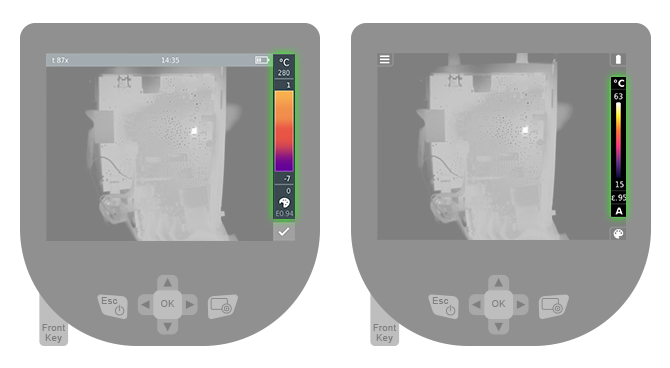
Fewer elements and a smaller design make for an equally helpful but less obstructing interface.
Here we were able to remove the upper and lower limit of the current application mode and therefore were able to reduce the needed height of the scale. Furthermore, we noticed that the numbers would exceed 4 digits and therefore we could fix the width of the scale to a bare minimum as well.
Finally, we had the "E0.95" emissivity factor that kind off used up 5 digits and in order to fix it we were able to remove the 0 before the comma. Only if the factor was "1.0" (the highest possible number) we would show the leading one and remove the last "0".
This helped us reduce the blocking elements quite a big step as well.
The custom button
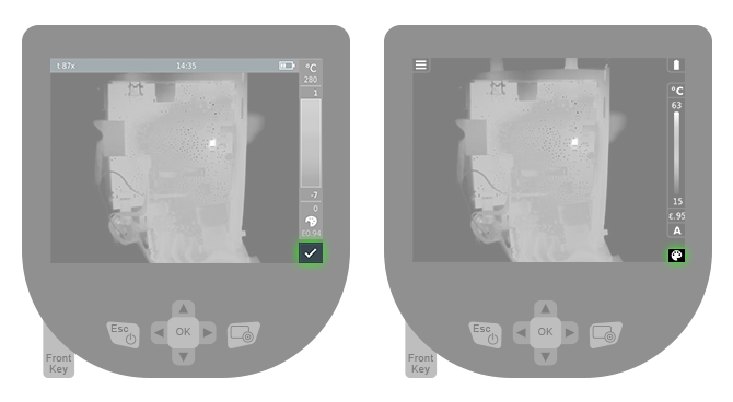
The custom button was hardly changed. Although the size shrunk the touchable area was increased.
This part of the UI hardly changed as it was already pretty small. We shrunk it to the width of the other side elements in order to make it look more consistent. Although the overall button was small the touchable reactive area was increased in order to maintain good touch interface behavior.
Bringing it all together
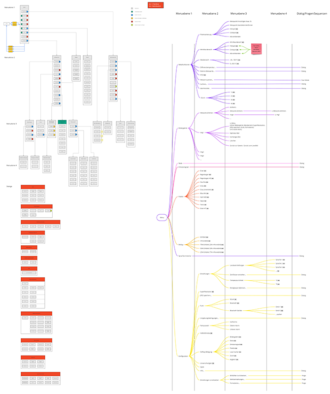
At the end of the process, I mapped out all functionalities in order to show the whole new systems in one easy understandable picture.
Apart from the touch functionality the improved camera added a few new features. I needed to make sure they fit the new interaction system as well, therefore I created a mind map and an interaction map to showcase all the elements the system would have. This helped tremendously to communicate the whole system to the developers.
The results
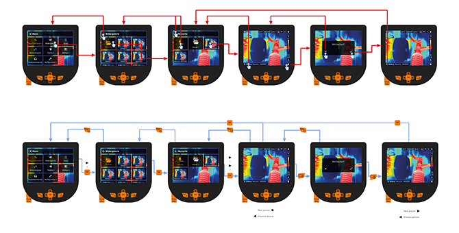
Example flow for opening a picture in the gallery via touch (red) and hardware keys (blue).
For this project I created a lot of flow deliverables so each interaction was easy to follow. Each menu got a separate flow to showcase how the interaction should work via touch and via hardware keys.
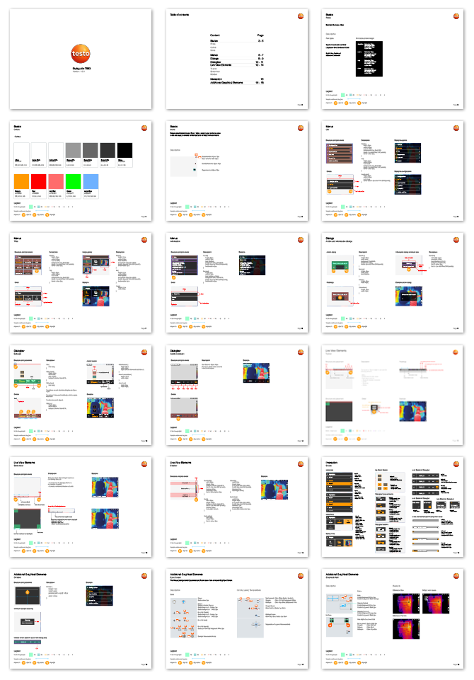
A style guide for the design system was created.
Next to the flows all design system details were also documented in a short practical style guide. As the overall screen layouts followed a system it was possible to keep the style guide short.
Left: Before, a lot of elements want the user's attention
Right: After, the focus is now clearly on the picture not on the interaction elements
This project was a lot of fun and working closely together with the product manager and the developer helped a lot. The end result brings the new camera interface to a new level and given the screen resolution restrictions we still managed to bring the user an even better product.

Left: Various old screen states; Right: Various new screen states