Reducing 56% of hardware buttons
Information Architecture ScalabilityIn this post I'm only covering a small part of the project. If you want to learn more about how I work: Here's my general process.
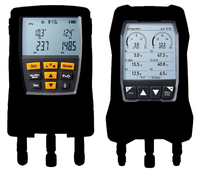
Left: Old design; Right: New design
Abstract: This project was a huge effort in developing and improving a product across several locations and stakeholders. My team and I had the chance to reinvent the hardware button layout and tailor the UI perfectly to the new interaction model.
Not only did we manage to reduce the number of hardware buttons and therefore making space for a much bigger screen. We also achieved a scalable information architecture that allows for structured continuous improvement of the features over time.
This project brought back so many childhood memories. I would play around with alarm clocks and get frustrated by complicated key layouts and hidden features one would only know about after consulting the manual. I guess that's when I started to read manuals for discovering features hidden in plain sight. Anyway on to the project...
The challenge
Apart from the UX topics the biggest challenge was understanding the technical details. But as usual that's the fun part about these kind of projects, kind of like a quest. Finding out all the details and then coming up with fresh ideas on how to improve it.
Similar to the infrared camera this product wasn't new but it was in need of a complete makeover.
In the kickoff the product manager gave us a rough walkthrough of the current device and the new features that should be added to the new one. Apart from that we were given quite some freedom in regards to the initial idea.
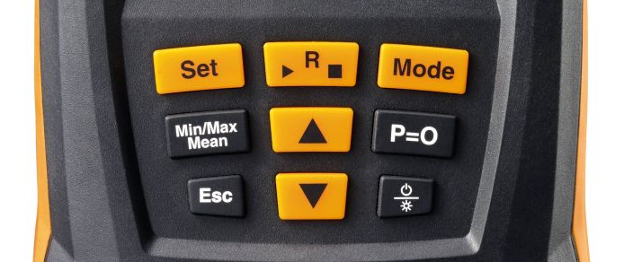
The old layout of the buttons wasn't exactly self-explanatory
I always wanted to work on such a device with a lot of technical restrictions and limitations. So I was pretty happy with the task at hand and already had quite a few ideas on what should be accomplished from an UX point of view: A super easy interaction with no need for a manual.
The process
Even before the kickoff I studied the whole manual and once the product manager dropped all the requirements, I continued to research everything about digital manifolds I could find.
Luckily quite a few technicians on YouTube talk about their devices and experiences with them. This was throughout the whole process really a great way to learn about different use cases and the conditions under which the product would be used.
Taking it apart
One of the first things I did after knowing all the requirements I took the soon-to-be-replaced device and mapped out all the functions it offered. The previous button layout was not self-explanatory at all: Every time I thought I found every function I would discover one more.
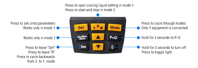
Analysis of the old button layout and functionality
Here's a great example of a hidden functionality: Turning on Bluetooth was only possible if the up- and down-arrow would be pressed simultaneously for a few seconds.
Putting it back together
Once all the options were laid out in front of me, I started to bring them in order. What is a setting? What is a mode? What is only needed sometimes? This would be very helpful in creating an information architecture.
Slowly everything started to make sense: How often would a setting be needed? Fahrenheit or Celsius? Some would rarely change and only be changed on the initial device usage; some would need to change more often.
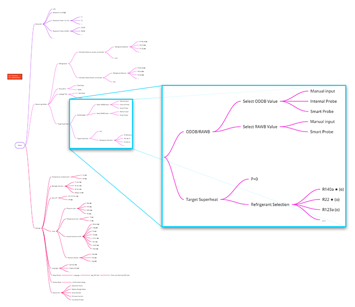
The mind map wasn't as complex - the bigger issues was understanding the terminology used in the industry and the underlaying concepts
Once the information architecture was created the rest of the process was somewhat straight forward.
Buttons, lots of buttons
The initial button layout consisted of 9 buttons. And each of them had a certain function. Some would always function, some only in a certain mode, some would change the mode and depending on what was connected to the device the user would get more or less options.
With the new information architecture and the knowledge about how often something would be used it mostly became a question about how to navigate the information architecture tree.
So basically, all needed were the following options:
- Back button – takes you back
- Forward button – select something or open the menu
- Up and down – change a selection
If you are reading this and thinking: A steering cross like on any gaming console. Yes! That's actually all that was needed. And the first layout ideas were exactly this.
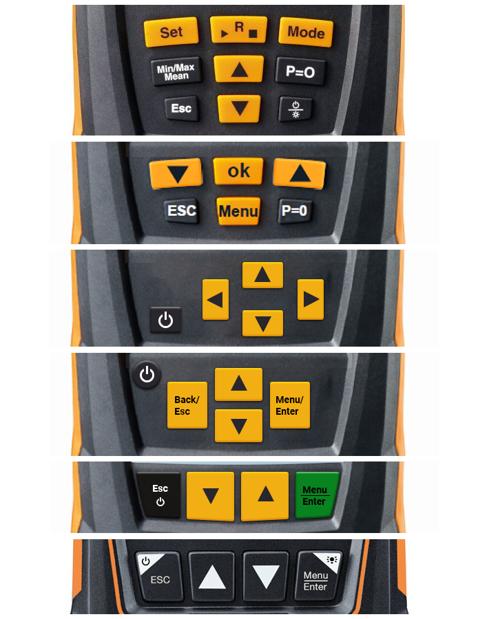
The new layout didn't just spring into life - the idea was there but it did take a few iterations to get to the final layout
But some iterations down the line we ended up with the following layout for a few reasons - mainly:
- Button size - imagine using this device with gloves
- Maximizing display size - four buttons in a row would allow for a much bigger screen
- Multifunctional buttons - add functionality by showing different labels on the screen
With these few buttons we could access everything. And from here on out the work on the UI could start. But I won't go into details here.
A few notes on the UI
The whole UI for this device is a story for another time. The biggest hurdles on this front were the decision for the display type, the stack that would allow to keep only nine (9!) screens in the device's memory (back button functionality heavily impacted by this one) and the Bluetooth behavior between this device and the companion App.
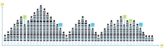
The stacking was another challenge for the navigation flows we needed to solve
The decision for the display was a mix between functionality, readability and costs:
- 7-Segement display: Your typical alarm clock might have such a display. Pre made segments are present in the display. The advantage is that you have crisp and sharp elements on the display – even better resolution than the best smartphone. But this display is limited to what you define in the beginning and layout-wise it gets quite tricky. This is an art form in itself to make great. We didn’t choose this one as it was too limited and didn’t allow for later changes.
- Full color LCD TFT Display: Great display, highly visible and lots of pixels and options. Biggest drawback though is the battery live. These things drain your battery in a short amount of time and for longer measurements this was no option. Also, the costs for color displays are quite a bit higher.
- Dot-Matrix-Display: Do you remember the old Gameboy from Nintendo? If you do then you know this type of display. It is super flexible as it is basically a Pixel Display, but restricted to only 240x240 pixels (in our case) and features a great battery live. This is the display that made it into the final product.
Given the restrictions of the Dot-Matrix-Display we still managed to pack a lot of features and visualizations in it. The limitations forced us to be quite creative and also remember how shading worked back in the day. Each pixel could only be on or off - so no different shades of grey.
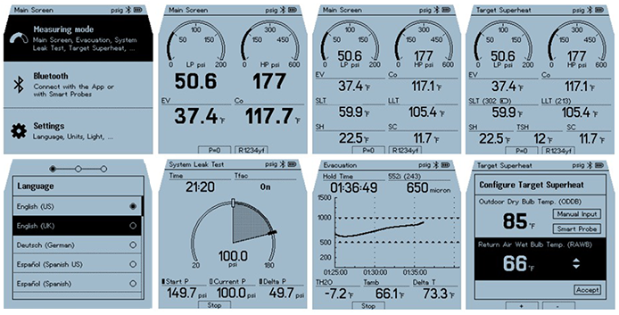
Adding graphs and gauges was quite challenging given the low-resolution display
But after a ton of iterations, we managed to create a really small and still readable font and a layout that would show everything needed for a measurement in one screen. Even adding visual aids to help indicate when something important is happening.
The results
Well to put it in numbers: We reduced the number of buttons by 56%. Therefore, we were able to increase the display by 52% while also increasing the individual buttons. The new UI is scalable and can easily be updated with new functions following the existing information architecture.
Feedback from users was really positive and the interaction with the device was not only understood immediately but also clicking through the menus was quite satisfying. One thing we noticed in the first user test was that the up and down buttons needed to be switched as all the menus would start at the top and users would always hit the wrong button first.
Finally, the device is adopted really well by the different markets although I can't share any business numbers.
As the project evolved over a year, we produced a ton of deliverables: Style guides to countless flow charts and interaction design between the app and the device.
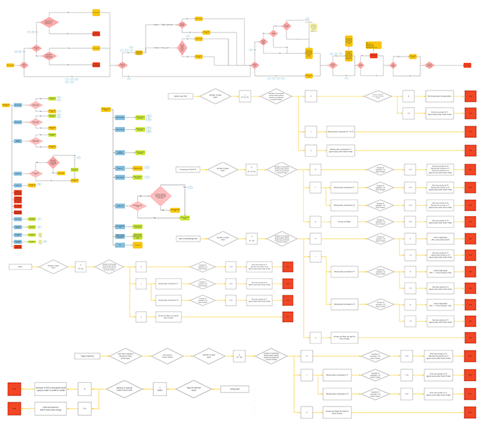
Just a small percentage of all the flows created in no particular order right here
This project was what I was looking for when I initially started at Testo. Being able to influence the hardware and software of a whole product to make it scalable under all the given restrictions was a dream come true. This whole project was only possible due to a great team across the USA, China and Germany.